Today’s Emini-Nasdaq offered a great example of Delta Divergence creating a resistance zone as it accelerated into a support level at 15700.
The example occurred on the 1-minute chart, which I’ve been using for my Volume Delta lately; however, the concept is applicable on all timeframes and markets given they offer suitable liquidity.
Congestion is easy to spot through the angle of price movement. It is any sideways price action where price is contained in a narrow range. If it looks like congestion, it is congestion.
Now what is happening with Delta in these congestion zones? First, we need to explain how Volume Delta works. If the bid is hit, then you’re going to see red, and if the offer is hit, then you are going to see green. What we are looking for is the larger positions and how price moves in relation to it.
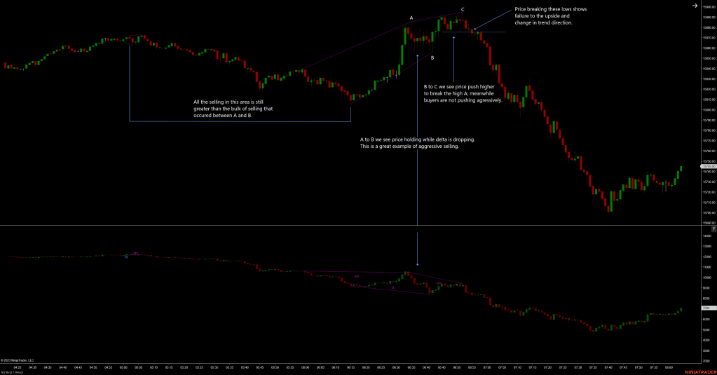
Price area A to B holds price forming a congestion zone while delta is dropping aggressively. Here a large position has been set right above the overnight session high.
Price area B to C pushes price higher but the aggressive buyers were not there. Consequently, more sellers jump in as price breaks the lows of area C.
Have a look through your own charts for some of these setups and try to see how these areas can potentially provide you with a lower risk, higher probability trade.
